
Create Rectangular Matrix
Principal component analysis requires a rectangular matrix from which covariances can be calculated. Consequently we need to ensure we have the same number of data points for each term.
Examining the raw dataset created in the previous step we see inconsistent data availability across terms.
The latest available observation date varies by term.
In the steps below we ......
- look for at the data availability of each term
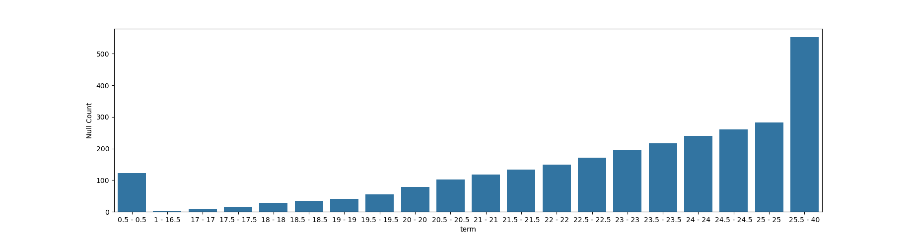
Null Count by Term before any truncation
The dataset of spot yields contains gaps insofar that the whole set of observation dates is not consistently available for all terms.
Truncation Choice
We want to choose a range of observation dates and terms that reduces the need to fill in gaps in the dataset.
In my initial analysis (that i have not yet repeated here) I established that from feb 2016 all data is available across all of the terms. I did this by looking at the first and last dataset for each term
2016 is not a very big dataset but gets us moving quickly.
We will want to repeat the null count on the truncated dataset to see if we need to fill in any gaps.
Check
check that it is indeed 2016 because claude seemed to reckon the following
Rows: Month-end dates. By the time you get to step5, 94 rows remain (2017-03-31 to 2024-12-31) because:
  - earlier steps truncate/interpolate around missing or negative values,
  - step4_differencing takes a 12-month (year-over-year) difference of the log yields (diff(12)) and drops the first 12
  rows (which become NaN from the lag).
i think may lose a year later on when we do the differencing
Null Count by Term after initial truncation
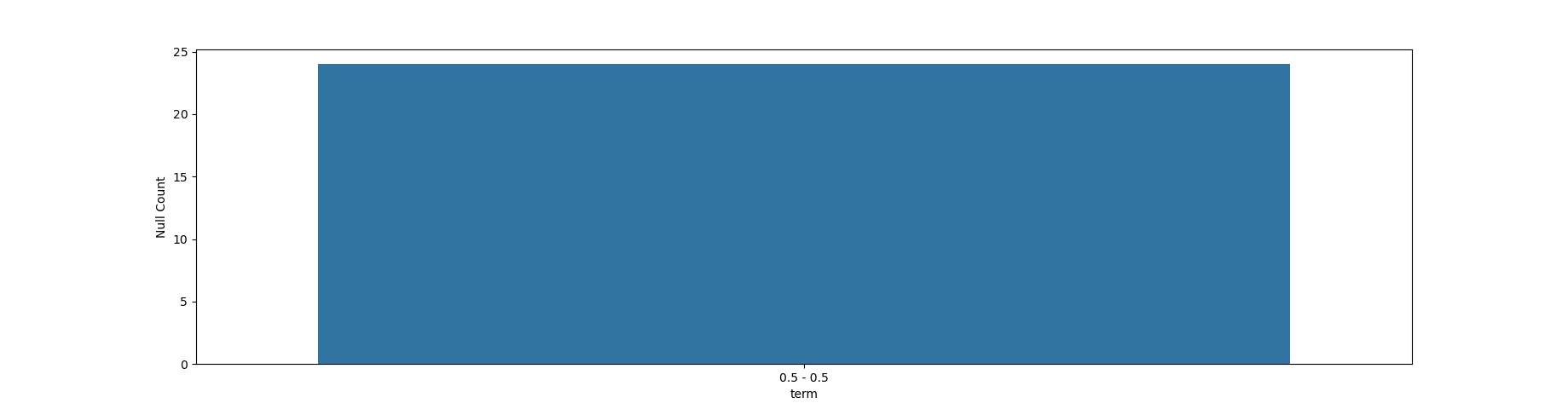
this observation makes sense. inspecting the data we see that 0.5 term has gaps even post 2016. From previous analyses i recall that early terms are problematic so I am going to model from term 5 onwards. This meands an additional (final) truncation.
Final Comments
We are pretty much done here. A nice tidy up, refactoring of code so that choices are parameterised would be something to consider on re-review
Python
Functions
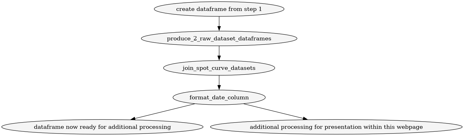
filename: step1_dataframe.py description: create dataframe from step 1 which is essentially the bank of england data
from dataframes.truncate_with_ellipsis import *
from dataframes.produce_2_raw_dataset_dataframes import *
from dataframes.round_numeric_columns import *
from dataframes.format_date_column import *
from dataframes.join_data_files import *
import pandas as pd

def step_1_dataframe(file_path1="raw_data/GLC Nominal month end data_1970 to 2015.xlsx",file_path2="raw_data/GLC Nominal month end data_2016 to present.xlsx"):
    """Load a spot curve file and apply formatting."""
    df1, df2 = produce_2_raw_dataset_dataframes(file_path1,file_path2)
    df = join_spot_curve_datasets(df1,df2)
    df = format_date_column(df)
    df = round_numeric_columns(df, 2)
    return df

filename: step2_count.py description: returns dataframe or html table of null counts
from dataframes.step1_dataframe import *

def create(to_html: bool = True):
    df = step_1_dataframe()
    null_counts = df.isnull().sum().rename("Null Count").to_frame()
    return null_counts.to_html() if to_html else null_counts


filename: step_2_data_boundaries.py
from dataframes.step2_count import *
import seaborn
import matplotlib.pyplot as plt

'''
this code produces a chart showing the null counts
see the create_snippets.py file for the one that calls this one.
'''

def databoundary_table():
    df = create(to_html=False)
    df[df>0].dropna()
    df2 = df[df>0].dropna()
    df2.index.name = "term"
    df2 = group_consecutive(df2)
    plt.figure(figsize=(18.4,4.8))
    ax = seaborn.barplot(data=df2, x="term", y="Null Count")
    #breakpoint()
    plt.savefig("chart.png")
    return df2.to_html()

def databoundary_chart(filename):
    df = create(to_html=False)
    df[df>0].dropna()
    df2 = df[df>0].dropna()
    df2.index.name = "term"
    df2 = group_consecutive(df2)
    plt.figure(figsize=(18.4,4.8))
    ax = seaborn.barplot(data=df2, x="term", y="Null Count")
    plt.savefig(filename)
    return


def group_consecutive(df2):
    groups = []
    start_idx = df2.index[0]
    current_val = df2.iloc[0]["Null Count"]

    for i in range(1, len(df2)):
        if df2.iloc[i]["Null Count"] != current_val:
            groups.append({"term": f"{start_idx} - {df2.index[i-1]}", "Null Count": current_val})
            start_idx = df2.index[i]
            current_val = df2.iloc[i]["Null Count"]

    groups.append({"term": f"{start_idx} - {df2.index[-1]}", "Null Count": current_val})
    return pd.DataFrame(groups)
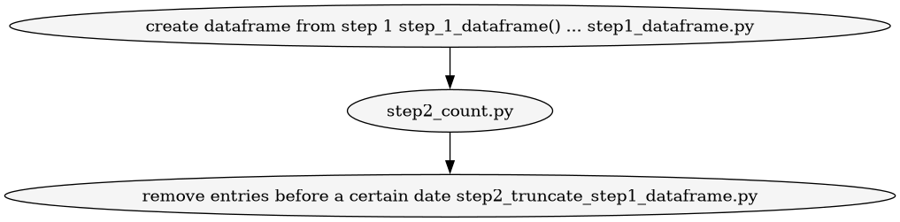
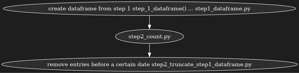
step2_truncate_step1_dataframe.py
from dataframes.step1_dataframe import *

def create():
    df = step_1_dataframe()
    df = df[df['Date'] >= '2016-03-01']
    return df
step2_count_after_truncation.py
from dataframes.step2_truncate_step1_dataframe import *

def null_count_truncated():
    df = create()
    null_counts = df.isnull().sum().rename("Null Count").to_frame()
    return null_counts
filename: step_2_data_boundaries_after_truncation.py
from dataframes.step2_count_after_truncation import *
import seaborn
import matplotlib.pyplot as plt

'''
this code produces a chart showing the null counts
see the create_snippets.py file for the one that calls this one.
'''

#def databoundary_table():
#    df = null_count_truncated()
#    df[df>0].dropna()
#    df2 = df[df>0].dropna()
#    df2.index.name = "term"
#    df2 = group_consecutive(df2)
#    plt.figure(figsize=(18.4,4.8))
#    ax = seaborn.barplot(data=df2, x="term", y="Null Count")
#    #breakpoint()
#    plt.savefig("chart.png")
#    return df2.to_html()

def databoundary_chart_after_truncation(filename):
    df = null_count_truncated()
    df[df>0].dropna()
    df2 = df[df>0].dropna()
    df2.index.name = "term"
    df2 = group_consecutive(df2)
    plt.figure(figsize=(18.4,4.8))
    ax = seaborn.barplot(data=df2, x="term", y="Null Count")
    plt.savefig(filename)
    return


def group_consecutive(df2):
    groups = []
    start_idx = df2.index[0]
    current_val = df2.iloc[0]["Null Count"]

    for i in range(1, len(df2)):
        if df2.iloc[i]["Null Count"] != current_val:
            groups.append({"term": f"{start_idx} - {df2.index[i-1]}", "Null Count": current_val})
            start_idx = df2.index[i]
            current_val = df2.iloc[i]["Null Count"]

    groups.append({"term": f"{start_idx} - {df2.index[-1]}", "Null Count": current_val})
    return pd.DataFrame(groups)
filename: step2_remove_upto_term_5.py
from dataframes.step2_truncate_step1_dataframe import *

def remove_upto_term5():
    df = create()
    df = df.drop(columns=[0.5, 1, 1.5, 2, 2.5, 3, 3.5, 4, 4.5])
    return df